...

Thursday, February 18, 2016

Foyer + Gray | A Makeover

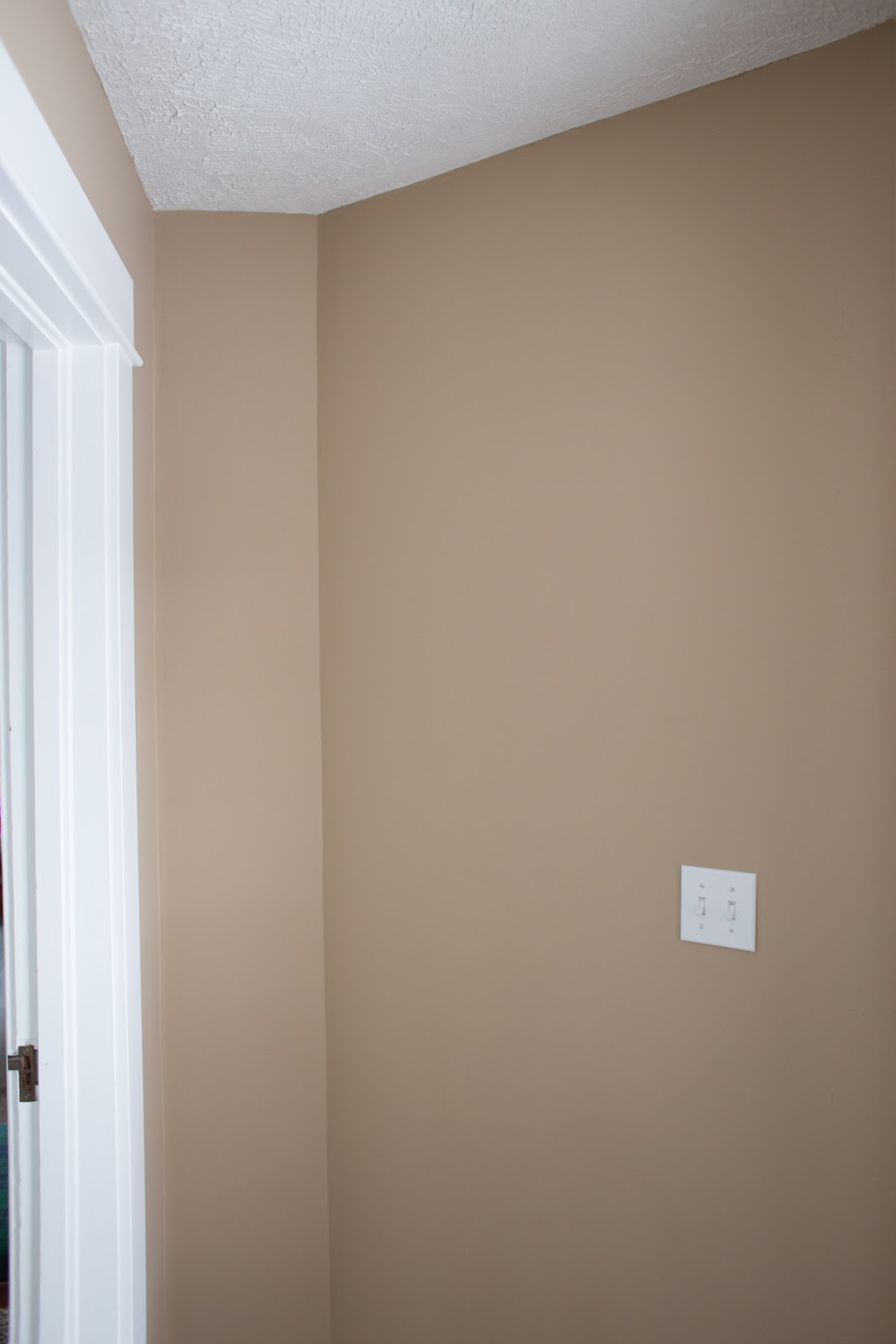
Oh, Khaki.
Khaki is a fine color - really! - but...it's not for me.

So far, we have been able to paint every room but the upstairs bathroom since moving in, so that warm, boring brown has almost been completely vanquished.

I'd been meaning to paint the foyer for ages, and I finally had enough of my other projects wrapped up to focus on it. It took two of Milo's naps to complete, but with some leftover paint from this project, it was free and fast.

Khaki be gone!


before


after

Two new coat racks means I have storage for guests as well as my small arsenal of camera bags!
I don't care a fig about Coach or Prada - give me Langly and ONA any day of the week :)


Cheers to making things new and you!

Friday, February 12, 2016

Have Courage and Be Kind | A Painting

The first time I saw the new Cinderella movie with my BFF Sarah (we're kindred spirits of the deepest level, especially when it comes to books and flights of fancy), I just about died of happiness. Not literally, but I was seriously elated for the longest time. The colors! The innocent romance! The acting! The songs! I was smitten with it from beginning to end, and knew I wanted Alice to grow up seeing it, especially because of this little phrase: "Have courage and be kind." What a marvelous anthem to live by!

Fast forward to a few weeks ago when I discovered this adorable print on Pinterest. As soon as I saw it I immediately wanted to have it painted on an old spare canvas sitting in my studio, just waiting for new life. (It used to be this painting.)

As you know, painting something verbatim is painful for me (remember the turtle?), but this design with it's colors and wreath of flora and beautiful gold script were worth the efforts required.

Here's the task, from blank beginning to glorious end...


inspiration
My mom was so nice and printed off the design for me so I could paint from it.


gold
Spray painted a nice splotch of gold for the middle.


free-hand typography sketch


a few layers of white


coffee + paint


lines


progress
They're not exactly the same, but close enough.
Translating graphic design to painting is challenging, but worth the end result!


finished


A gallery wall for Alice!
Feels so whimsical :)
Sandwiched the canvas between gold frames to tie in the metallic look.


Have courage and be kind.
:)

Monday, January 25, 2016

Watercolor + Frames | A Makeover

I mentioned here that January is my favorite time to freshen up the house and art work is the easiest/cheapest way to do it! That calendar I bought at Anthropologie for 2015 was full of beautiful watercolor illustrations and I knew they would make the perfect pieces scattered around the house.

Here are a few new ones for Milo's room...


nursery update
Easy peasy!
(And did I mention free?)

Cheers to making things new!


Monday, January 18, 2016

Frames + White | A Makeover

As much as I love Christmas-time with the tree and lights and decorations, by January 1st I'm ready to start over with a clean slate and start fresh in the house. The new year is when I look back at the projects accomplished and dream about the ones I still want to make happen.

Swapping artwork is on the docket every year, and I had just the thing to use to make updates!

The calendar I bought at Anthropologie for 2015 was full of beautiful watercolor illustrations and I knew they would make the perfect pieces scattered around the house.

With a fresh coat of white on the playroom frames - my decorating answer for everything - they instantly felt more lively and modern.

Enjoy the process to product!


watercolors
I don't own a mat cutter right now, so instead of borrowing one - or hiring it done - I decided to crop the actual image with a box cutter and mount them on black mat boards I cut to fit the frames. Still looks sharp, but about 90% easier!


la bicyclette et l'éléphant
Last year's project here.


white
I know I have mentioned it in previous posts, but I am in love with this paint by Benjamin Moore (ADVANCE Waterborne Interior Alkyd Paint). It covers so well and hardens to a shellac that is durable and smooth. I'm still on my first bucket and I have used it on dozens of projects, including painting the upstairs hallway trim and banister and the trim in Alice's room. Totally worth the money.


photo corners


gold
It's all in the details, and I knew things would sing sweeter if they were accented in gold.


glazier points
I mat and frame all of my own work and like to use these little guys to anchor the backs.


fresh & fun


Cheers to a new year, new art, and making things you.

Monday, September 28, 2015

Mirror Mirror on the Wall | A Makeover

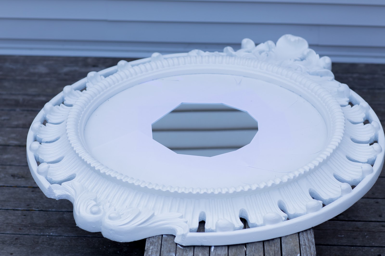
Earlier this summer I scored a beautiful, grand mirror on Blair Swap (thanks, Niki!) for my photography business - bonus that it gets to hang out on my wall when I'm not using it as a prop! - but it was very...antiqued. Now don't get me wrong, I adore antiques, but I don't like when a new thing has been made to look weathered and old. While it was pretty, I knew it could look a whole lot better and decided to give it a fresh coat of white - my decorating answer to just about everything.


My inspiration? This beauty:

I'm just a little obsessed with these ginormous ornate mirrors.:

via myparadissi.com


I couldn't disassemble the mirror, so I had to cover it with paper in order to keep it clean.

I thought I'd be brilliant and spray paint all of those nooks and crannies (that's a spray paint gun - a must-have if you go through more than one can at a time) but for whatever reason, this can was absolute garbage. I shook it up - like the dozens of cans I've shaken before - but when I pushed the nozzle down it sprayed out like silly string. Terrible! Definitely should have sprayed the grass or something else first instead of coating the top of it with spackled confetti, but I've always learned things the hard way. (Although, in my defense, it's Krylon and should have been awesome.) Almost the whole can was a waste and I ended up taking it and the other one I had bought back to the store.

I wasn't going to chance it again, so I busted out my trusty bucket of Benjamin Moore's ADVANCE Waterborne Interior Alkyd Paint (pricey, but worth it). I have used this single gallon for loads of projects this past year and it still hasn't run out! I also love that it hardens like shellac and smooths out when drying to erase brush marks. So after a few hours of brushing in all of those crevices, I finished.


(We're getting a new deck soon so I didn't have to worry about making a mess on it.)


aperture!
Fellow photogs will get this.


before & after


Aaaaaahhh. So crisp! So fresh!
It still looks grand and exquisite, but now it's got more of a contemporary air.
(I might be plotting to paint the dining room this color, too...but don't tell JD. I just painted this room last year and he's a paint-once-every-10-years kind of guy.)

Cheers to making things new!